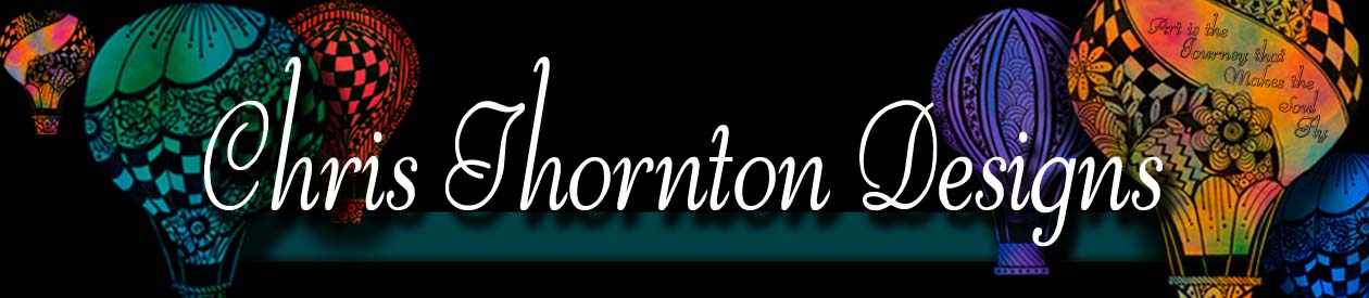
Now let’s bring in the fun of course this
is the color. I personally love color; so let’s make it work
for us. First consider the intensity (vibrancy) of the color
remember the closer the object the more intense the colors
are. Second is the value of the color (lightness or darkness)
the closer the object the more contrast there will be. As
shown in the picture we are painting, the vibrancy and the
contrast of colors, is much greater in the objects that are
close and fades as they retreat into the distance.
Intensity (how bright or faded a color is) = depth
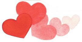
Red scale value range starting from White to Black.
High value range
White
Created by adding red to white
9
8
7
6
Middle value range pure red
5
4
3
2
1
Low Value
Created by adding black to red
Black
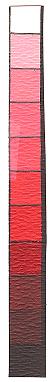
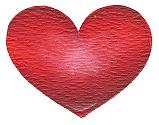
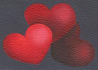
Simple heart shape
3 values = Dimension
3 values = Depth
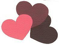
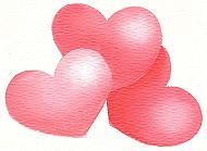
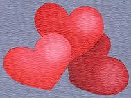
Three examples of high, medium and low value range painting
High value range from White to 5
Background Light Ivory
Back heart 7
Shade 5
Highlight 9
Middle heart 8
Shade 6
Highlight9
Front heart 9
Shade 7
Highlight white
Middle value range from 2 thru 8 Background Cape Cod Blue
Back heart 4
Shade 2
Highlight 6
Middle heart 5
Shade 3
Highlight 7
Front heart 6
Shade 4
Highlight7
Low Value Range from 6 to black
Background Midnight Blue